cvat
Climate Valuation Assessment Tool
The Challenge
Risk analysts and relationship managers at Credit Suisse faced a significant hurdle: a cumbersome, manual process for integrating crucial climate and emissions data into their financial transaction risk assessments.
They struggled to effectively visualize and compare pre-deal analysis against baseline results, making it difficult to accurately and confidently assess climate-related risks.
Our core challenge was to create a user-friendly platform that simplified the comparison of these intricate datasets, empowering them to make informed, data-driven decisions.
Product Overview
A Strategic Solution
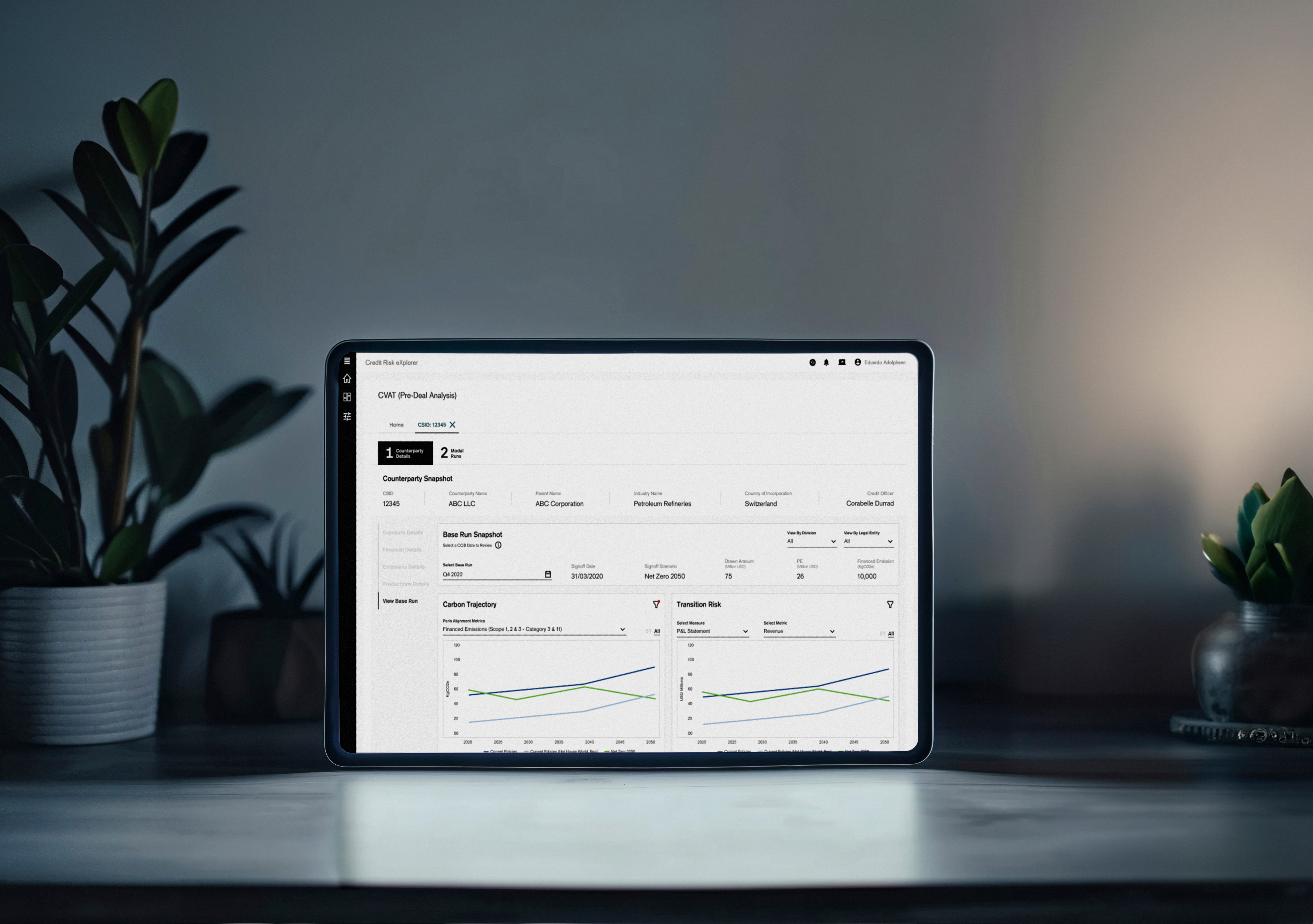
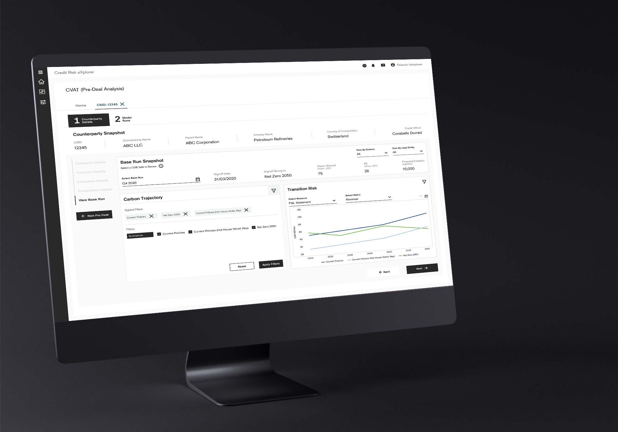
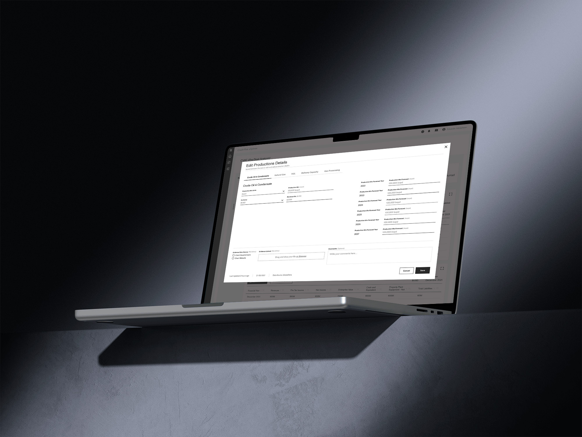
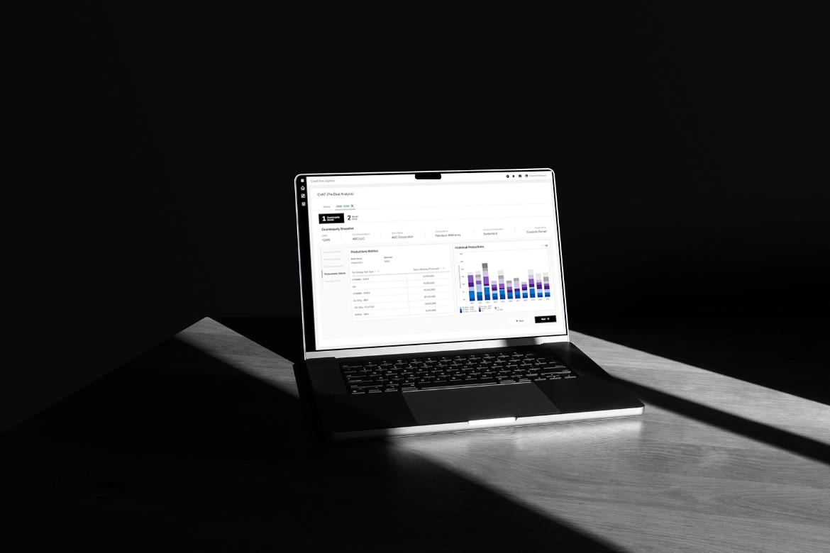
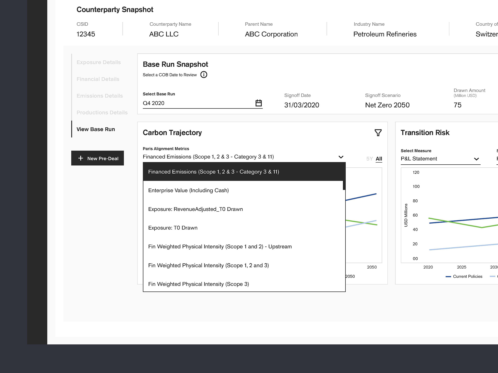
The Climate Valuation Assessment Tool (CVAT) was an internal application for Credit Suisse's CRX climate risk platform. It was designed to streamline the integration of climate and emissions data from counterparties into a base model. The tool aimed to provide a clear, comparative analysis of pre-deal results against this baseline, enabling risk analysts and relationship managers to make more informed decisions about climate-related financial risks.

Research Process
Understanding the User
Our research phase was instrumental in deeply understanding the operational realities and specific pain points of Credit Suisse's risk analysts and relationship managers. We conducted a mix of qualitative user interviews and observational studies, supplemented by quantitative surveys, to build a comprehensive picture.
A critical insight emerged: the existing process for incorporating climate data was not only laborious but also lacked the necessary visualization tools, leading to significant frustration and hindering accurate risk assessment. We distilled these findings into detailed user personas and empathy maps, which clearly articulated user needs, their current workflows, and the precise moments where the lack of an integrated tool created significant friction.
This deep dive directly informed our design priorities, emphasizing the need for an intuitive interface that could present complex data in an easily digestible, comparative format.
Design & Development
Concept to Creation
Our design and development methodology for CVAT was iterative and highly user-centric, directly translating research insights into tangible solutions. We initiated the process with rapid prototyping, utilizing low-fidelity wireframes to explore various layouts for the interactive comparison tool and streamlined data input forms, continuously validating these early concepts with stakeholders.
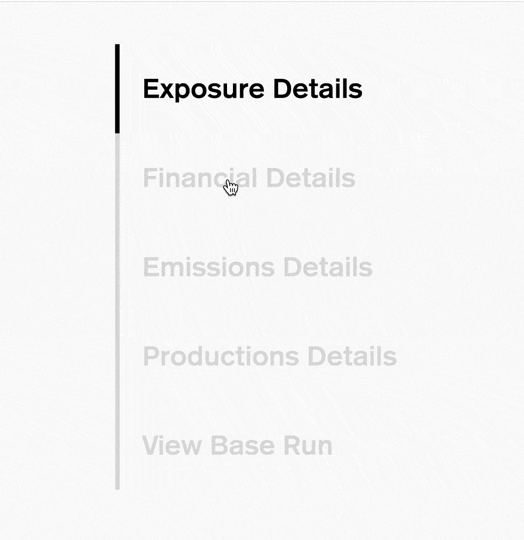
As we progressed to high-fidelity mockups, our focus sharpened on creating an exceptionally clean and visually intuitive interface, with a strong emphasis on effective data visualization to make intricate climate and emissions data immediately comprehensible.
The seamless integration of CVAT within the existing CRX platform was a core design principle, ensuring intuitive navigation and a frictionless user experience. We maintained a tight feedback loop with the engineering team throughout development, ensuring technical feasibility and a robust, scalable architecture for all features, including the dynamic comparison functionalities.
Impact & Learnings
Key Takeaways
The development of CVAT yielded several profound learnings. Foremost was the criticality of continuous stakeholder engagement, particularly within a complex, highly regulated financial environment. Maintaining an ongoing dialogue with risk analysts, relationship managers, and the IT department from inception to deployment was crucial for ensuring the tool met precise functional requirements and adhered to stringent compliance standards, proactively addressing potential issues.
Another significant takeaway was the power of "designing for complexity with simplicity." We discovered that effectively abstracting vast, intricate datasets through clear, intuitive visualizations was paramount to empowering financial professionals, enabling them to make confident, data-driven decisions on climate risk without being overwhelmed by underlying scientific complexities.
This project also reinforced the importance of focusing on measurable impact, guiding us to not only deliver a functional tool but also to quantify its direct contributions to improved efficiency, reduced risk exposure, and enhanced decision quality within Credit Suisse.