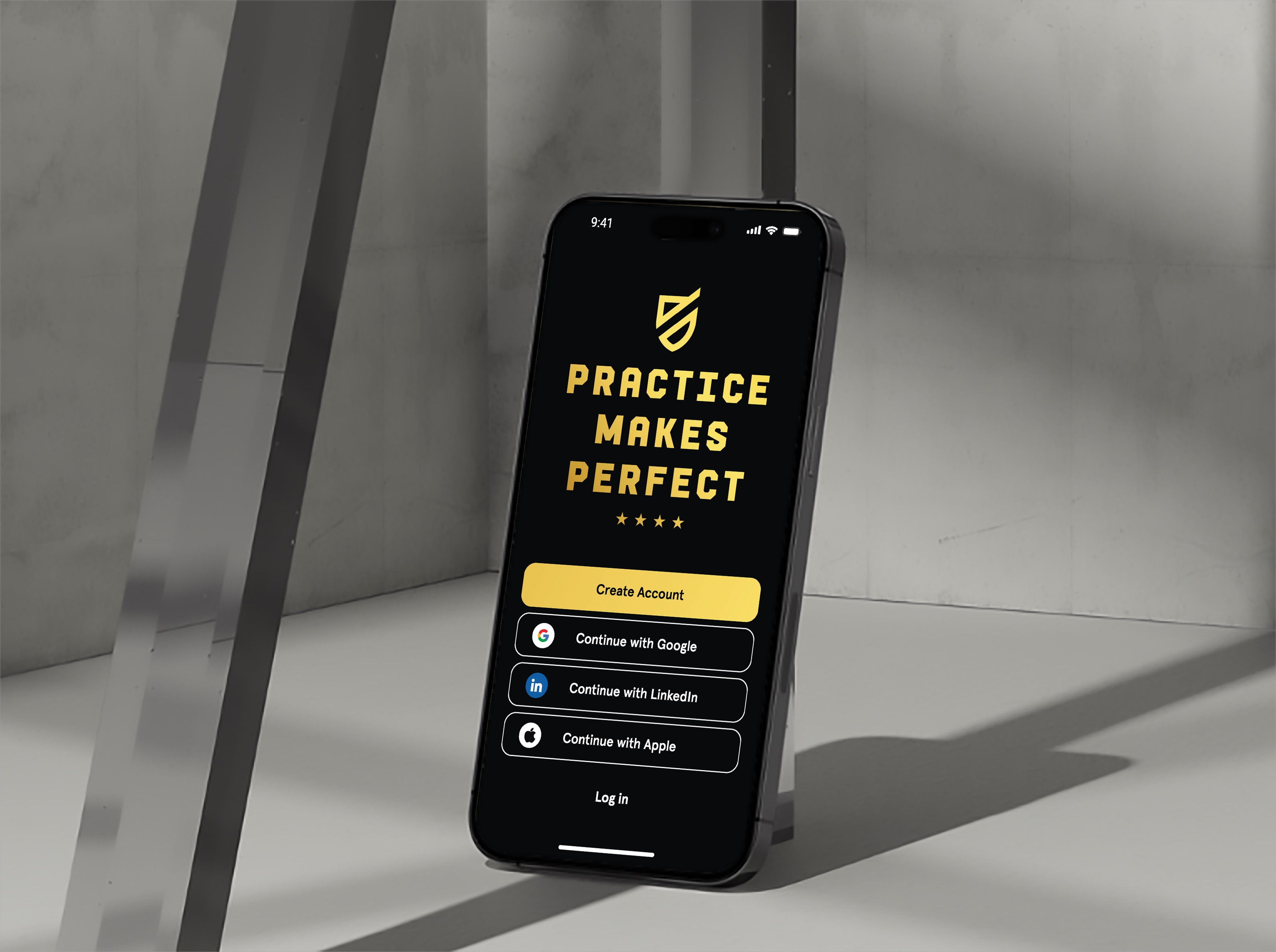
Practice makes perfect
Attendance Tracking & Reporting Platform
The Challenge
Practice Makes Perfect relied on paper-based processes for tracking attendance and daily program operations, leading to delays, errors, and limited visibility. Interventionists and site managers spent valuable time submitting reports manually, slowing down oversight and scalability. The challenge was to replace these fragmented workflows with a streamlined, digital solution.
Product Overview
A Strategic Solution
I was tasked to design a centralized internal platform for site staff and administrators to manage attendance, schedules, and reporting. The tool aimed to reduce manual work, improve data accuracy, and give leadership real-time insight into program performance—supporting PMP’s mission to scale high-impact enrichment programs efficiently.


Research Process
Understanding the User
I conducted interviews and observations with site managers, interventionists, and administrators to understand workflow gaps and user frustrations. Research revealed major pain points around redundant data entry, inconsistent communication, and time-consuming reporting—all of which directly informed the product’s core features.
The research phase was instrumental in deeply understanding the operational realities and specific pain points of Credit Suisse's risk analysts and relationship managers. I conducted a mix of qualitative user interviews and observational studies, supplemented by quantitative surveys, to build a comprehensive picture.
Design & Development
Concept to Creation
Starting with low-fidelity wireframes, I mapped out the essential workflows: checking students in and out, logging daily activities, and submitting program reports. A mobile-first design approach ensured usability for on-site staff using tablets or smartphones.
Based on user feedback, I introduced features like auto-saving forms, confirmation modals to reduce errors, and a simple slider element for the grading system.
Through iterative design reviews and usability testing, I refined the experience to balance simplicity with functionality. A strong emphasis was placed on reducing cognitive load and making the app feel intuitive—even for users with limited tech experience.


Impact & Learnings
Key Takeaways
The redesigned digital prototype tool tested and proved to drastically improve operational efficiency. Users that I tested with reported significant time savings—what once took 20–30 minutes at the end of the day was reduced to a 5-minute digital task. Administrators would gain real-time visibility into site-level data, enabling quicker decision-making and stronger oversight across their programs. Overall user satisfaction increased across usability tests, as the app reduced administrative burden.
Designing for workers with limited time and pushed me to focus on clarity, accessibility, and error prevention. I also gained experience collaborating with stakeholders across technical and non-technical backgrounds, aligning on priorities and finding solutions that balanced user needs with organizational goals.